Shipped worldwide · A new piece every fortnight.
AW 2026/27 Colour Trends: The 7 Shades to Know (and How to Wear Them)

Every season the runways quietly agree on a handful of colours, and those shades trickle down into everything you'll want to wear months later. For autumn/winter 2026-27, the palette is unusually rich — part icy restraint, part jewel-toned decadence. Here are the seven shades to know, and, more usefully, how to actually wear each one.
1. Icy Blue
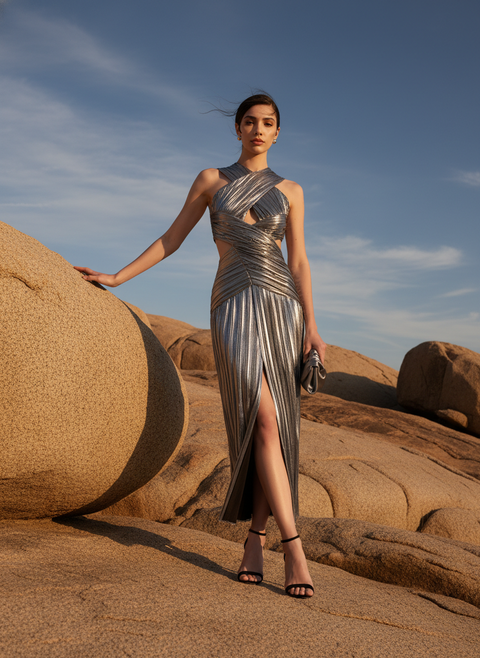
A frosted, polar blue seen at Dior, Victoria Beckham and Tove — the season's 'snow queen' shade. It's cool, clean and surprisingly versatile. Wear it against black for contrast, or tonally for a serene, modern look. A cool-blue maxi captures the mood.
2. Rich Teal
Not quite blue, not quite green — teal reads expensive and mysterious, and appeared at Saint Laurent, Alaïa and Loewe. It flatters nearly everyone and pairs beautifully with black, chocolate or a flash of gold. One of the easiest trend colours to bring into occasionwear.
Colour is the fastest way to look current — and the cheapest way to feel new.
3. Vibrant Purple
Decadent and a little aristocratic, seen at Balenciaga, Burberry and Valentino. Deep purple has real evening presence. Temper it with sand or taupe by day; let it go full drama in a gown after dark.

4. Cloud-Dancer White
Pantone's 2026 Colour of the Year — an airy, serene off-white with a hint of putty. It signals a clean slate and looks quietly luxurious in a fluid silhouette. Ideal for those who find their drama in cut rather than colour; a white Grecian gown is the reference.
5. Chartreuse Green
Polarising and impossible to ignore — Prada, Erdem and Simone Rocha all made the case. Wear it as the single loud note in an otherwise neutral look, or pair with sand and taupe to let it breathe.
6. Canary Yellow
Brighter and more confident than last year's butter tones, spotted at Bottega Veneta, Loewe and McQueen. A joyful, high-contrast colour that comes alive under strong light — which makes it perfect for a winter-sun escape.
7. Candy Pink
Sweeter and punchier than powder pink, from Stella McCartney, Patou and Blumarine. Toughen it with charcoal, chrome or patent black so it reads modern rather than saccharine.
How to wear a trend colour (without looking like you tried)
The trick is proportion. One saturated piece against neutrals always looks intentional; three trend colours at once looks like a mood board. If bold colour isn't your language, bring it in through a single statement dress and keep everything else quiet. Explore the season's colour across the new arrivals and IT'S HAUTE edits — and see how these shades translate to party dressing next.